Contents
The Objects
This tutorial expands on the instructions set forth in Harsh Agrawal's Community Site version and focuses on look development and lighting.
The scene recreates studio lighting as well as organic objects and adds depth of field for better realism. We'll dissect each object and its shading first.
Modeling
When creating assets, it's important to understand which objects fall into certain categories and model their detail accordingly:
- Hero assets - Things like main characters and the focus of a shot or story
- Set assets - These may have varying levels of detail based on where they are in a scene. Close-up items may need more details
- Props - These are often kept as simple as possible, you'd be amazed at how good texturing can take a low-detail asset and make it look quite nice!
RenderMan is designed to render subdivision surfaces when possible for animated characters and hero objects. This reduces possible tearing and improves the look of characters and organic objects seen up close. This is also a good choice when using displacement. Polygons like to come apart when displaced, so convert to a Subdivision Surface.
When modeling for Subdivision Surfaces, keep these things in mind to get the shape you want but not destroy performance:
- When converting to a Subdivision Mesh using the default Catmull-Clark scheme, to avoid over-dicing, use quads only. This means all your faces have 4 sides. Avoid triangles and N-sided faces.
- Only model the bare minimum detail you need in the base mesh so that the resulting surface is the correct shape when subdivided and not more.
- Keep creased edges to a minimum, they can be expensive.
- Make use of higher micropolygonlength settings. This provides automatic level-of-detail, and higher numbers are more coarse but can still be enough to look good. Try settings anywhere from 1.5 to 3 for reasonable production quality. (Note that if this is too coarse you will get shading artifacts especially along edges, reduce the value slowly. Anything less than 1 is very high quality.)
Polygons are also quite useful for anything with hard normals (faceted faces for many inorganic things like buildings, props, set pieces, etc.) You may soften these normals for closer rendering or add more modeling details to make it look nice but be aware that silhouette artifacts may appear during shading if that's insufficient. But despite these caveats, polygons for background and prop objects will render just fine and perform quite well. These objects are typically not deforming and plentiful in your scene. Making these subdivision surfaces can balloon your memory usage for little visual impact. Make use of bump mapping instead of displacement on polygons or convert them to subdivsion surfaces for displacement.
When laying out your UVs, avoid overlapping UVs and keep an eye on UV shells with flipped edges as this can cause artifacts when displacing or warnings during the render.
Our texture caching mechanism can handle filling the scene with high quality textural details and looks, but we need the whole scene geometry to trace against to live in memory. By being careful with your modeling choices you can fit quite a lot into your scene and render many many gigabytes of textures at once.
Understanding the basic design of PxrSurface.
The main material used for making objects, props, and characters in RenderMan is the PxrSurface material. This is a single (and therefore "monolithic") material used for all kinds of shading jobs. Each section of the material represents a particular "lobe" of the material.
A few examples of these lobes are:
- Diffuse
- Specular
- Rough Specular
- Sub-Surface
- etc.
Each of these has their own set of controls for defining the look and how they combine with the other lobes through gain or weighting.
Why is it called a "lobe"? You can visualize how a material reflects or transmits light based on its distribution function, these are usually visualized as a lobe (an elongated shape showing sharpness, power, and direction) in 2D or 3D. You can find out more on Wikipedia.
The basics of texture maps.
Take a look at the table as a basic material with a wooden color and glossy finish using textures. And while it's slightly reflective like polished wood, it's not too shiny. References are key to be sure you achieve the correct look prescribed by your art director or your own goals. At first this seems simple but there are many things to take into account by breaking it down with some quick tips and hints and then the examples.
Standard texture naming, recommendations, and usage ideas:
- Textures should be named appropriately based on their destined effect and object assignment. For example: <object>_<effect>.jpg or possibly tableTop_specular.jpg
- Do not use spaces and special characters in names like: theCar&boat.jpg or "the Car and Boat.jpg"
- Do not use spaces and special characters in file paths either. These textures may fail to load.
- Texture sequences should have a clear naming convention for frame number. mySequence.0001.jpg is correct rather than mySequence0001.jpg or mySequence.jpg.0001
- Most formats can be used such as .png, exr, .tif, and .jpg, but to be rendered they must be converted to the .tex format. In Maya this happens when you begin a render and cached on disk to be reused until changed or updated in the scene. Scenes with many textures may take awhile to convert the first time to render.
- Occasionally interchangeable naming pairs occur, consistency is important to your pipeline and artist's ability to work accurately.
- Diffuse and Albedo
- Roughness and Glossiness (please take note that RenderMan uses the standard "Roughness" convention where 0 = mirrored and 1 = rough or nearly diffuse) Roughness also applies to a Diffuse parameter so occasionally artists substitute Glossiness as the name.
- Textures can be color (RGB) and scalar (greyscale) and color channels can be connected to matching parameters to drive them. For example, the Red channel of an image can use used to drive a scalar (float slider) if it's useful.
- Normal maps are typically preferred over bump maps (scalar or grayscale) for their detail.
- Linear color workflow is highly recommended and textures where their color is visible in the final render should be linearized (the typical sRGB gamma curve should be removed for rendering). Textures used as data like bump, masks, and displacement, should not be linearized.
- Displacement maps and other data textures should be the highest precision possible to avoid artifacts from texture quantizing. Usually these are exported from modeling applications as floating point EXR or Tiff. See workflows for normal and scalar displacement.
There is no particular reason not to use the Maya File Node for texturing if it has the features you require or you enjoy the simplicity of using the Maya workflow for things like texture sequences. If you require a viewport representation of your texture, use a file type Maya recognizes (.tex and .tx are not currently supported) and the Maya File Node. This should display in the Viewport to aid in texture placement.
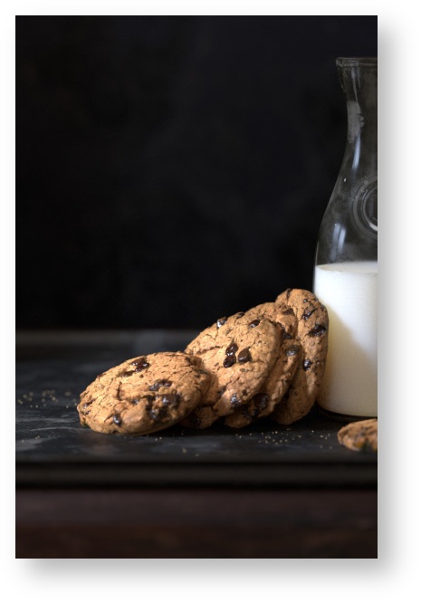
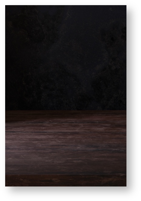
Wood Table
The table makes use of a few different texture maps. One is for the diffuse (sometimes called albedo) color, this controls the actual color variation and result for the wood. This is the most basic form of color mapping for objects and is independent of reflection color and other material effects.
Another is a specular map used to define the amount and locations of reflection and highlights on the surface. This map can define the color of a reflection as well as its strength across the surface. Some variation here is important for realism unless you're creating a product render where the object is new and perfectly untouched. Scratches and other defects can be added. Take care to match these effects with other useful maps like a bump map so that the surface features are all accounted for correctly. You probably wouldn't want a surface with scratches and wear without a matching bump map. You may notice this is dark, you'll find that the PxrSurface specular color is sensitive to light values and can become bright quickly.

A roughness map adds variation in the specular map roughness result. Few objects in the real world have perfectly mirror-like surfaces and objects with a rougher, glossy finish, are rarely uniform in their appearance. Controlling this with a texture map will help provide realism and create signs of wear and use across the table. It's useful for things like fingerprints, smudges, grease marks, wear from rubbing and touching, or natural variation in the manufactured materials.
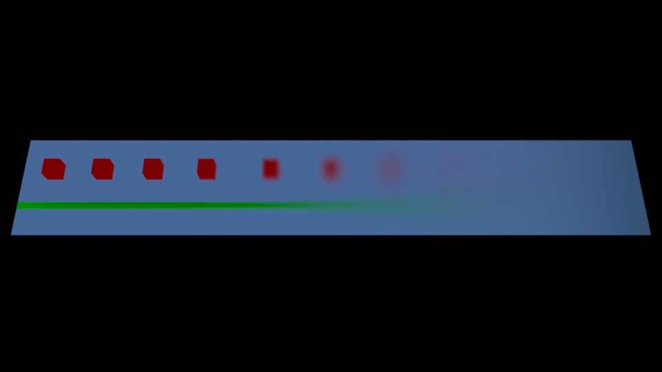
As a further example, the roughness below increases left to right from a value of 0 to 1
An added normal map improves the details by "faking" surface shape and details. The final rendered result is below.
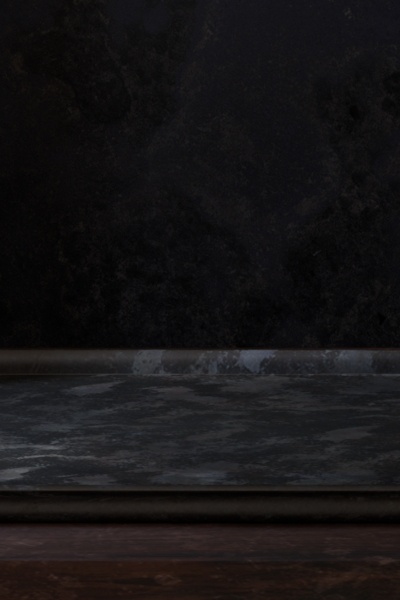
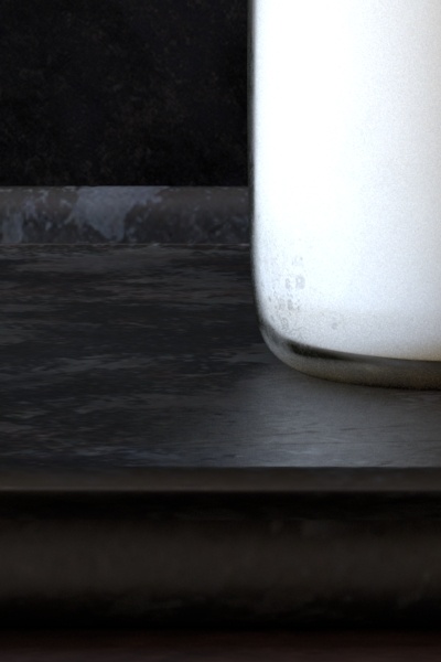
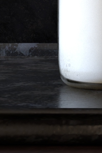
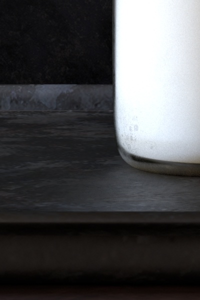
The Tray
The tray that the main objects rest on has a similar treatment to the wooden table. To the left you can see it here without the objects on top. And another image where the milk has been added and a close-up to better see the surface texturing and variation for specular and specular roughness.
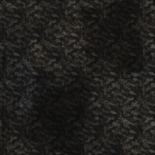
Below are the actual textures used to create the effects on the tray. These are square textures (1:1) and that ratio is preferred for texturing work when possible. Note images displayed here are more compressed than their actual project counterparts to improve page loading. In order left-to-right are Diffuse, Specular, and lastly Specular Roughness.
A final normal map is added to create the illusion of surface details and shape without resorting to using displacement to actually change the shape of the tray.
Passing maps through utilities to aid in look development.
Painting texture maps may happen where there's limited feedback as you paint them. This means you may have a texture ready to try, but you haven't decided if it applies the effect you want correctly. It may be too dark or too bright. Your roughness map may be too rough or not rough enough. Endless variations may force you to go back and forth with your chosen painting program and that can become frustrating.
Using the IPR mode in Maya, you can pass your textures through some utility nodes and make some value adjustments directly in the render.
The pattern networks can be evaluated during the render every time it processes the texture or you can bake the result and improve overall efficiency for complex assets. (You might want to avoid baking things until you have final approval from the client to avoid endless trips to the render farm.) Some patterns are more expensive to evaluate than others and can begin to impact your scene render times. Baking can improve this since it's simply evaluated once as a texture and cached. You can find out more on the topic of efficiency by looking at the article on Improving Performance.
While Ptex can save time preparing assets for texturing, the performance is not as good as using standard textures on objects with UV's defined. This cost and benefit balance should be weighed when planning a project. If you have many objects to texture, Ptex may save your artists time overall. Otherwise you may find better rendering efficiency and simplification with texture maps and typical UDIM (or "tiled") UV layout.
Below, the Specular Roughness texture is changed using a PxrColorCorrect node and adjusted in Maya's IPR. Different Gamma values are used in the Color Correct section of the pattern. Since the texture is a grayscale (scalar) map, the RGB channels all have identical values. Only the Red Channel is manipulated and then connected to the Primary Specular Roughness parameter. Alternatively you could connect the Color Correct pattern to a conversion node like the PxrToFloat pattern, but this adds another evaluation to the node graph that's not necessary in this example.
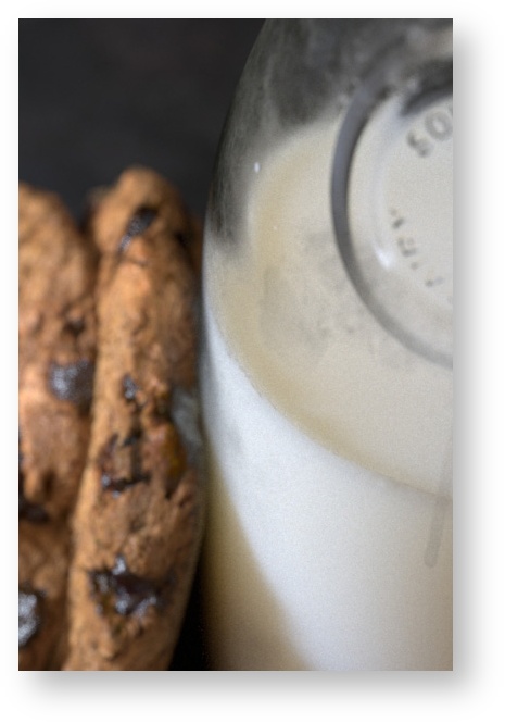
Milk Bottle
Now we can take a look at the Milk and Bottle.
The milk itself is un-textured and will be covered later, so we'll isolate the bottle and discuss how it achieves the "dirty bottle" look realistically.
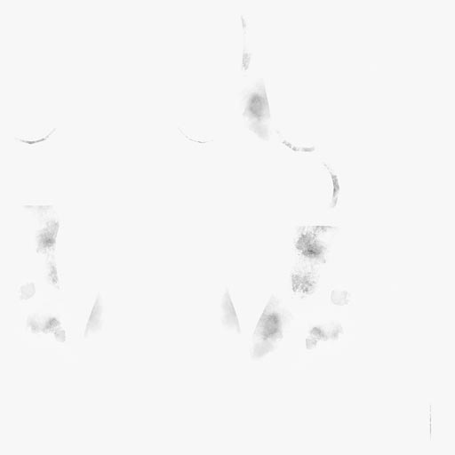
Glass has a few characteristics that make it special. And because of this, the PxrSurface material has an entire section designed to recreate glass and the most common looks. To understand imperfect and dirty glass, you can try and dissect what's happening in the image. For imperfect glass there will be variations of roughness across the surface. Unlike crystal and a few other surfaces, many older and worn glass objects are not perfectly reflective or transmissive (refractive). There's also the addition of fingerprints and smudges on the surface of the glass. You can use masks to generate these and add them to the diffuse lobe to mix in even more tings like dirt, paint, and dust.
Layering this affect more easily has two options we'll talk about and a third concern about trace depth covered in another document:
- Using PxrLayerSurface to separate and then combine the shading of the glass and the dirt.
- Correct UV layout to prevent texture repetition on the inside and outside.
- Controlling ray depth appropriately to get the right physical result for glass.
It's best to model objects volumetrically. They should have actual thickness and the space between the glass surfaces works just the way it does in the real-world and should behave as you would expect. Avoid two-dimensional models unless it makes sense to do so for things like leaves or paper.
When rendering most glass containers with liquids, it's helpful to understand intersection priority to avoid artifacts and "air gaps". This is technically known as the dielectric interface or nested dielectrics.
![]()
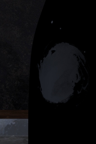
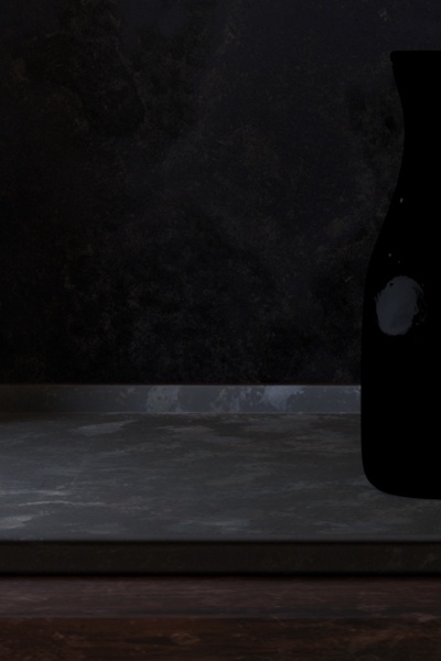
First we'll look at the glass layer by removing the upper dirt/milk layers.
![]()
![]()
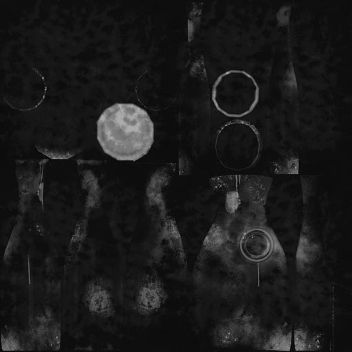
In the glass base material the diffuse channel has some dirt at a low gain of 0.2. The low gain combined with a darker texture will insure the effect isn't too opaque which would make the bottle look like it wasn't made of glass. Notice the interior and exterior walls of the bottle are mapped separately. It doesn't usually make sense for a fingerprint to be on the outside and inside of a bottle.
The reflection gain is textured just like the tray and table to define where the bottle is most reflective or the lest worn and dirty.

The refraction color is what tints or attenuates the transmission of light through the glass. In this case, to imply more imperfections, a map has been connected to this color input. The white areas signal that the glass in these areas are clear and colorless.
The roughness is similar to the diffuse map but the color has been removed and the blackpoint has been altered. This means there should not be any area on the texture that's perfectly black or 0 0 0. Instead it's slightly lifted to 2% to give even the clearest areas a slight roughness which is realistic for this image.
Above this glass layer is a simple dried milk smudge map applied as an upper layer in the PxrLayerSurface. A simple mask is applied to a white diffuse color. Below is that that diffuse color and mask rendered on the bottle.
Here is the mask used, it is applied in the PxrLayerMixer to globally control the "MilkDirt_Layer"
These are then combined for the final result. You'll find this to be straightforward with the Mix node that's auto-created when you select the option to make a PxrLayerSurface material.
The Milk
The milk surface is actually simple to create. The PxrSurface pages provide a useful table of data used to create common items using Subsurface Scattering. Populate the parameters under the Subsurface rollout with the correct color values.
After this there are 2 simple ways to control the result you require:
- Gain - use this to control the weight of the effect artistically
- Post Tint - use this to create chocolate milk!
Another control users may have to adjust but typically only once is the Mean Free Path Distance. This option controls the amount of scattering distance based on scene units. It's important to get this parameter to a reasonable number to avoid problems like noise.
For milk, the light that enters the liquid will only scatter so far into the medium before it is absorbed. This means a more realistic value follows that understanding. If the value is too low, the light doesn't scatter enough and the object appears more solid. If it's too large, then it will scatter light too far and introduce noise or artifacts. In the case of the milk, 1.0 is chosen based on the scene scale and how far light may travel into the liquid medium. A very high setting, say 10 or 15, is actually outside the container as measured in scene units. That's not realistic since this means the scattering travels beyond the liquid itself and even the glass container. While it may be pleasing, it will be slower, introduce noise, and not be realistic for milk. Users that spend too much time tuning this measurement while ignoring the scene scale may experience frustration trying to re-balance the other controls to compensate.
For materials not listed in the table you can start with something in the table that best matches your target look and then alter the color and gain appropriately. The recommendation for Mean Free Path Distance remains the same however.
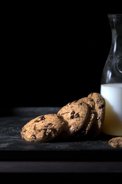
The Cookies
The cookies are mainly a diffuse object with just a hint of scatter. The chocolate chips are shiny and almost molten in appearance. This is achieved using similar methods to the objects above and adding in the scatter as an effect you learned about in the milk above.
There's also a displacement to add modeling details and some small particles to add crumbs to the surface and table. You'll notice that close-up the crumbs may be floating but this is an exaggeration so that it's easier to notice from a distance.
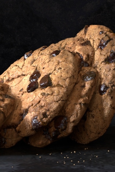
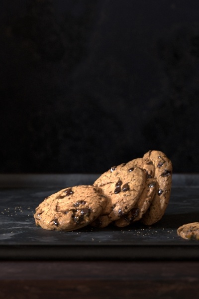
Below is the shader network for the cookies. Each on is repeated and rotated. This creates the illusion they are all a bit different and it works well in this scene.
The remap nodes are used to adjust the cookie specular properties in the render as mentioned in the Tray section.
The Crumbs
A particle system is used to create the crumbs of the cookies. The material is simple, a matching brown color and a very slight specular color on the edge.
Lighting
This scene makes use of a common three-point lighting scene. There is a fill light that makes use of the PxrDomeLight, a rim and key light that use a PxrRectLight.
With the exception of the Fill Light, the other lights use the emission focus to create a softer edge and a subtle spotlight effect.
Fill Light
The light used to fill in dark areas and shadows provides a base lighting and is referred to as the fill light. A high dynamic range image (HDRI) is used in this scene. When using the PxrDomeLight, it requires a textured as an input and it should contain a wide range of values, many of them over 1.0. This should be an EXR, TIFF, or HDR image. You can find some free examples from Maxime Roz here.
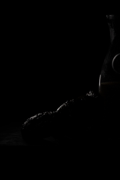
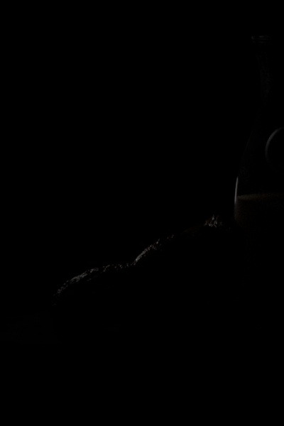
Below the light is at a default balance after being dimmed some. The second right-hand image is with the adjust specular amount to 0.5 instead of 1.0
Rim Light
Rim lighting can be used to define a shape or silhouette. The name "rim" comes from the fact it outlines the rim or edge of objects.
Below it has been added as a PxrRectLight and then to the right, it's adjusted to a lower specular amount to make it more pleasing and subtle. It's only necessary in this image to improve the silhouette some, not highlight it to strongly.
Key Light
The key light is your main light source in this image. It's typically the brightest light in the image and helps define things like the time of day, the source of the light, and the quality of the air (if it were to be smoky or dusty).
Here it's placed off screen to feel as though it's a natural window light. The specular amount is again reduced on the right to soften highlights and produce the final image when combined with the other two light sources.

The Softbox
The scene is modeled with a set of walls used as a softbox. Softboxes are used to bounce and diffuse light in a scene. Since RenderMan makes use of global illumination, this photography trick works like it does in the real world. You can change the amount of diffusion from the softbox by changing the diffuse gain and color.